BP2019RH1 - Visualization Brainstorming 16.12.
Wanda Baltzer, Theresa Hradilak, Lara Pfennigschmidt, Luc Prestin, Moritz Spranger, Simon Stadlinger, Leo Wendt
2019
Software Architecture Group
Hasso Plattner Institute
University of Potsdam, Germany
---
### Preparation
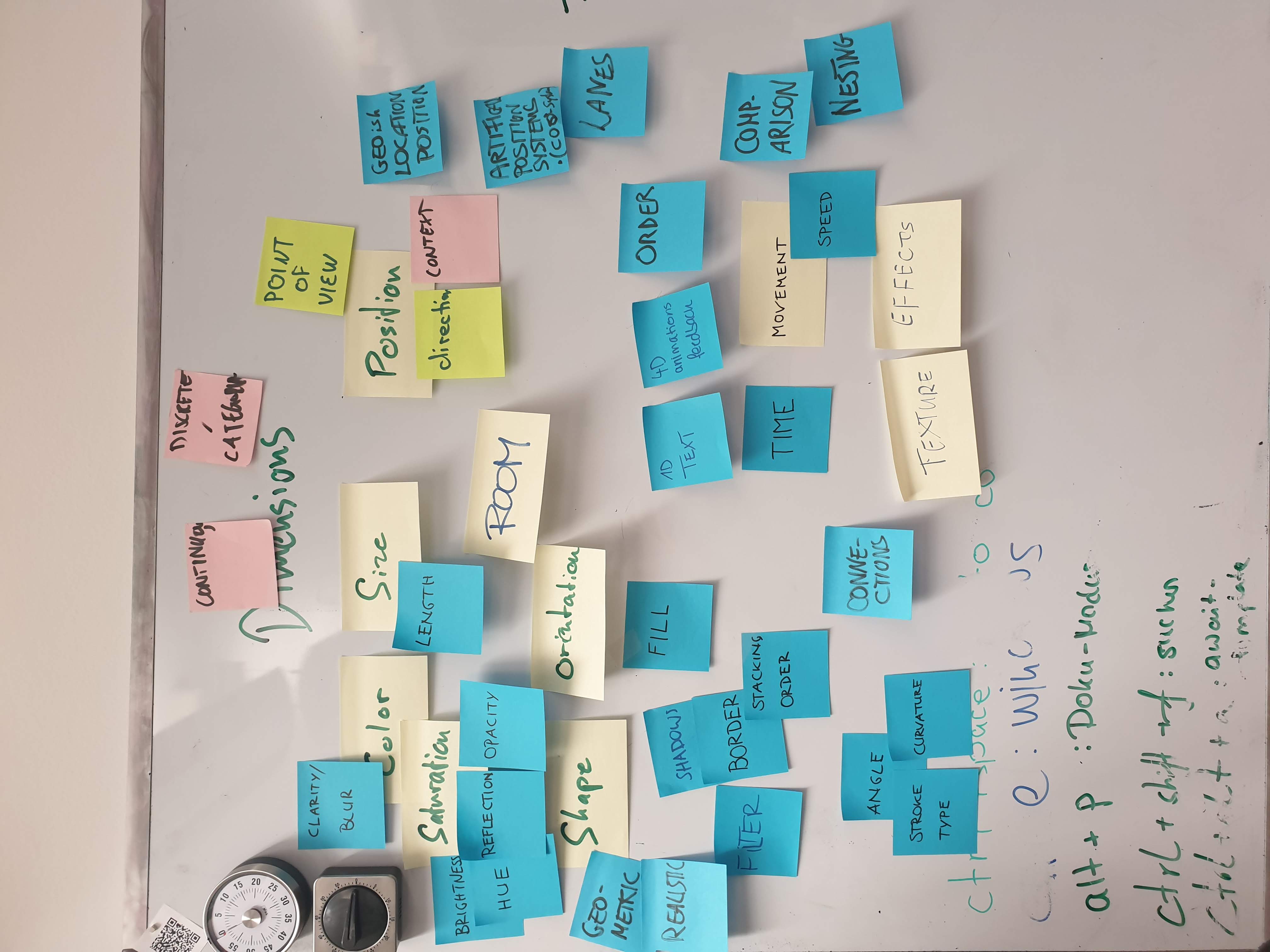
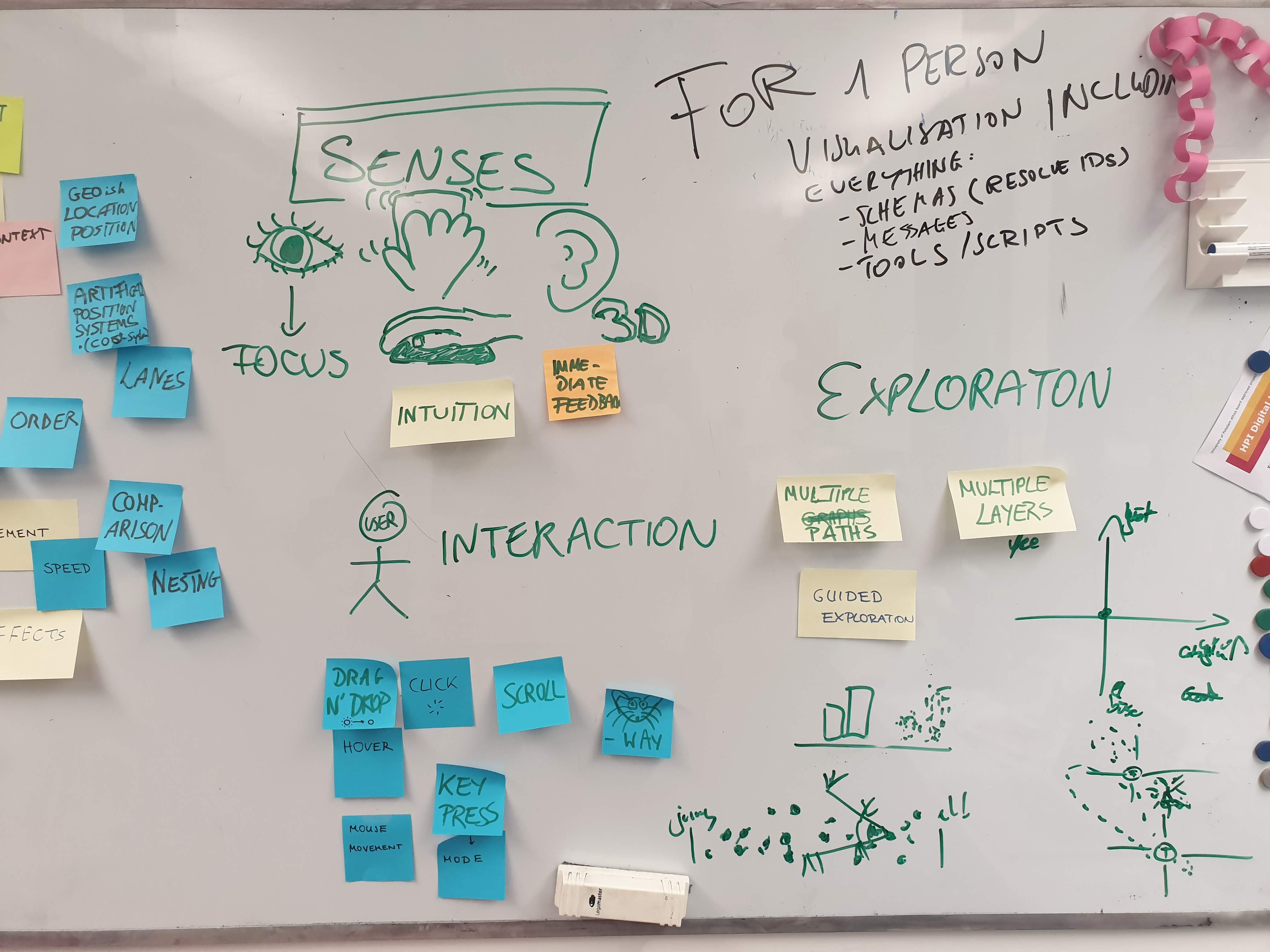
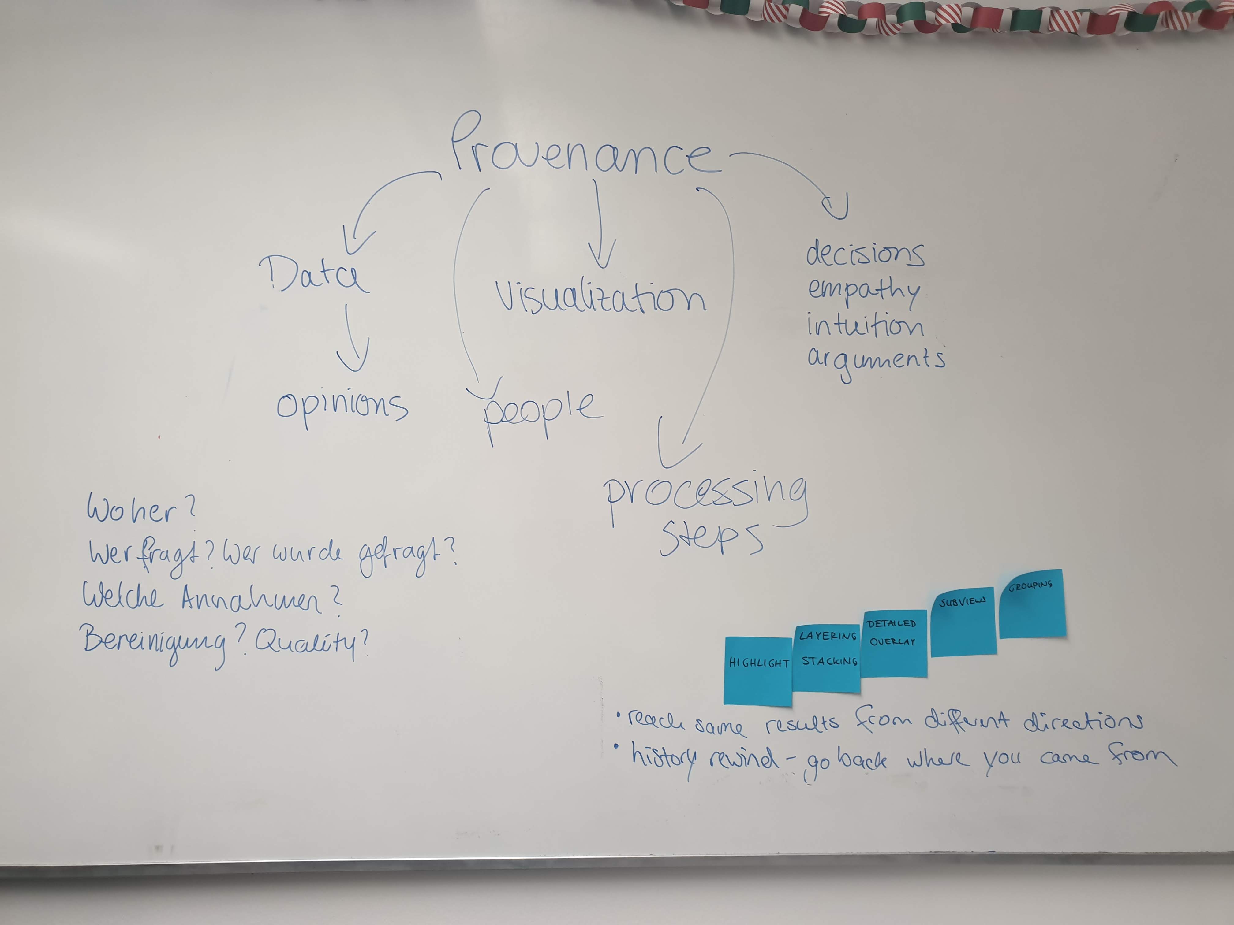 ---
### 1 Map of Somalia 1 / Many diagrams next to each other
---
### 1 Map of Somalia 1 / Many diagrams next to each other
 #### Explanation
- themes are written in districts with font size enconding number of times messages were sent expressing this theme
---
### 2 Map of Somalia 1 / Many diagrams next to each other
#### Explanation
- themes are written in districts with font size enconding number of times messages were sent expressing this theme
---
### 2 Map of Somalia 1 / Many diagrams next to each other
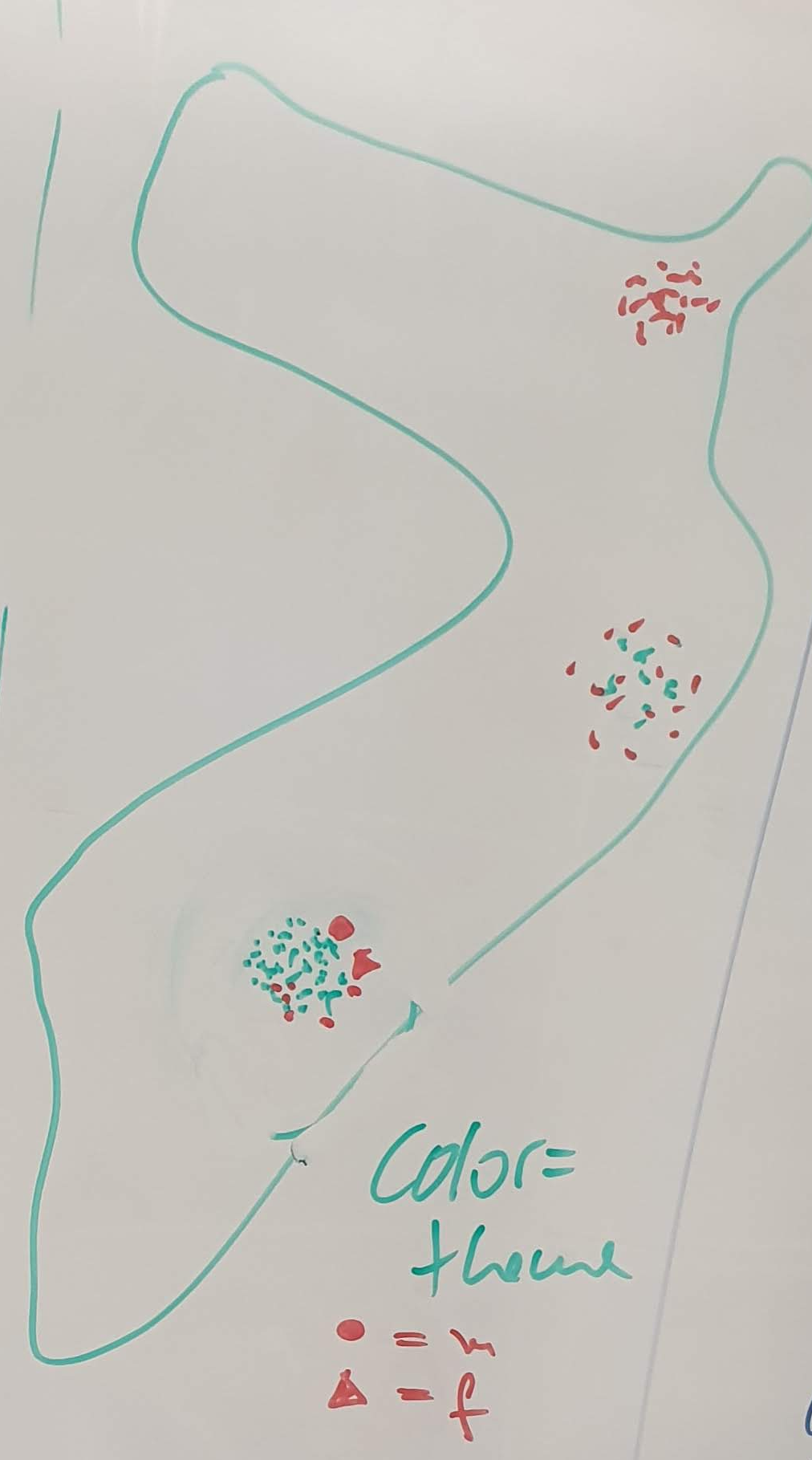 #### Explanation
- in all districts every datapoint is drawn as a small circle
- color encodes theme
- other attributes such as gender / age can be encoded via shape
---
### 3 Many diagrams next to each other
#### Explanation
- in all districts every datapoint is drawn as a small circle
- color encodes theme
- other attributes such as gender / age can be encoded via shape
---
### 3 Many diagrams next to each other
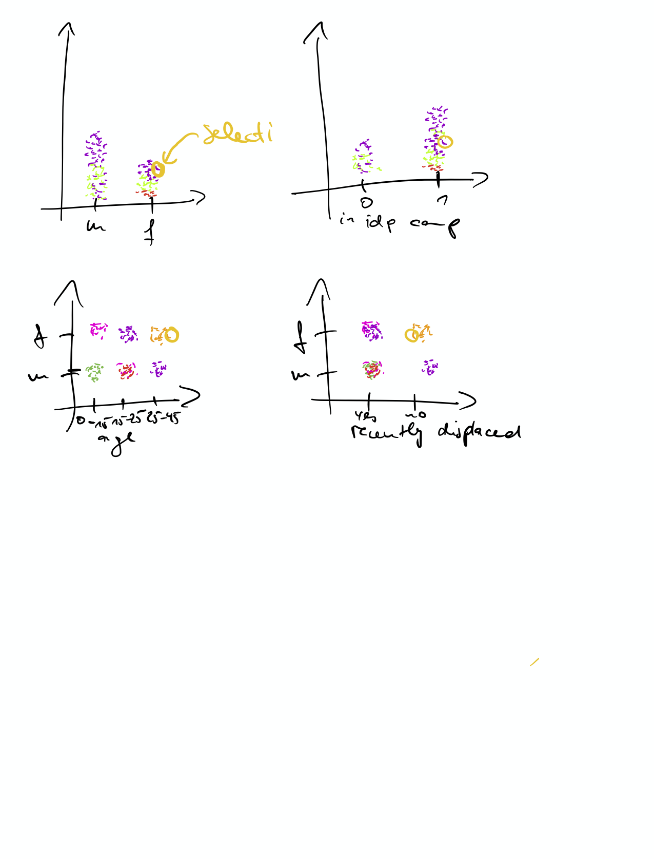
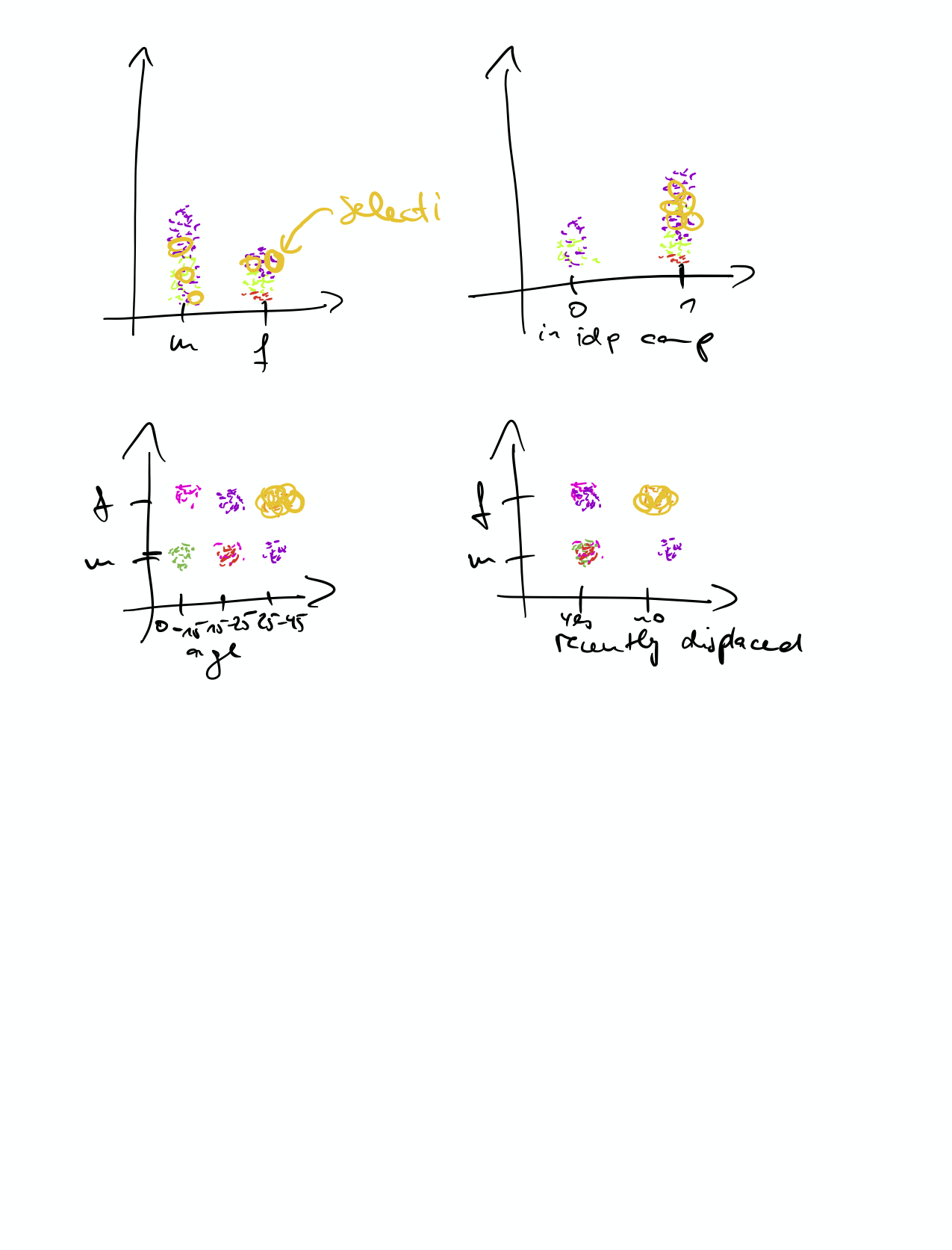 #### Explanation
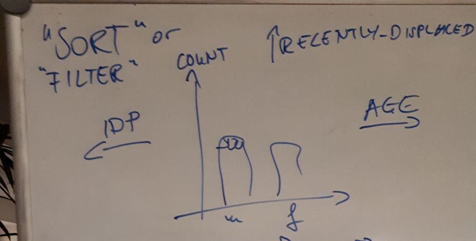
- diagram with several coordinate system, where different variables can be plotted against each other
- e.g. m/f vs idp status, age vs count, ...
- selecting a datapoint in one diagram selects the same datapoint in all others
- selection of multiple datapoints is possible
---
### 4 Many diagrams next to each other
#### Explanation
- diagram with several coordinate system, where different variables can be plotted against each other
- e.g. m/f vs idp status, age vs count, ...
- selecting a datapoint in one diagram selects the same datapoint in all others
- selection of multiple datapoints is possible
---
### 4 Many diagrams next to each other
 #### Explanation
- list of different messages is shown (selection of messages randomly or by some measure selection by diversity, maybe 10 or 20 or 50 or 100 or some other number)
- when you click on a message several diagrams are displayed with the datapoint corresponding to the message highlighted
#### Alteration
- you see messages and diagrams simultaneously and can see the different demographic groups of the individual sending the message more quickly
---
### 5 Map of Somalia 2
#### Explanation
- list of different messages is shown (selection of messages randomly or by some measure selection by diversity, maybe 10 or 20 or 50 or 100 or some other number)
- when you click on a message several diagrams are displayed with the datapoint corresponding to the message highlighted
#### Alteration
- you see messages and diagrams simultaneously and can see the different demographic groups of the individual sending the message more quickly
---
### 5 Map of Somalia 2
 #### Explanation
- Piecharts are placed on every regional unit containing values the individuals that belong to this regional unit answered. The values are chosen with a filter / switch.
- When clicking on a pie-chart the values can be filtered for this district. The filter can be changed in the toplayer or any sublayer.
---
### 6Graphs for Messages / Individuals
##### 3
#### Explanation
- Piecharts are placed on every regional unit containing values the individuals that belong to this regional unit answered. The values are chosen with a filter / switch.
- When clicking on a pie-chart the values can be filtered for this district. The filter can be changed in the toplayer or any sublayer.
---
### 6Graphs for Messages / Individuals
##### 3
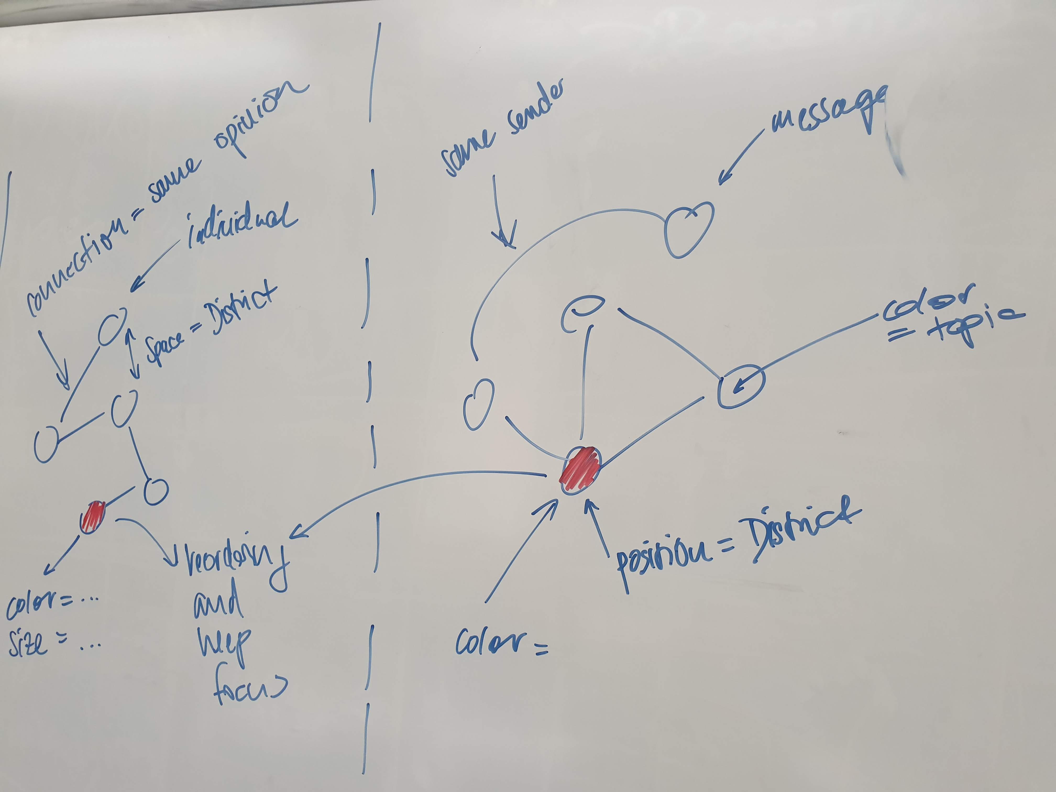 - a 2D/3D graph where each node represents an individual
- lot of dimension to encode information
- possible use case: select specific nodes which you want track across different reorderings
- we have to think about how represent the dimensions when each node is a message
---
### 7 Display Message Processing Flow
##### 1
- a 2D/3D graph where each node represents an individual
- lot of dimension to encode information
- possible use case: select specific nodes which you want track across different reorderings
- we have to think about how represent the dimensions when each node is a message
---
### 7 Display Message Processing Flow
##### 1
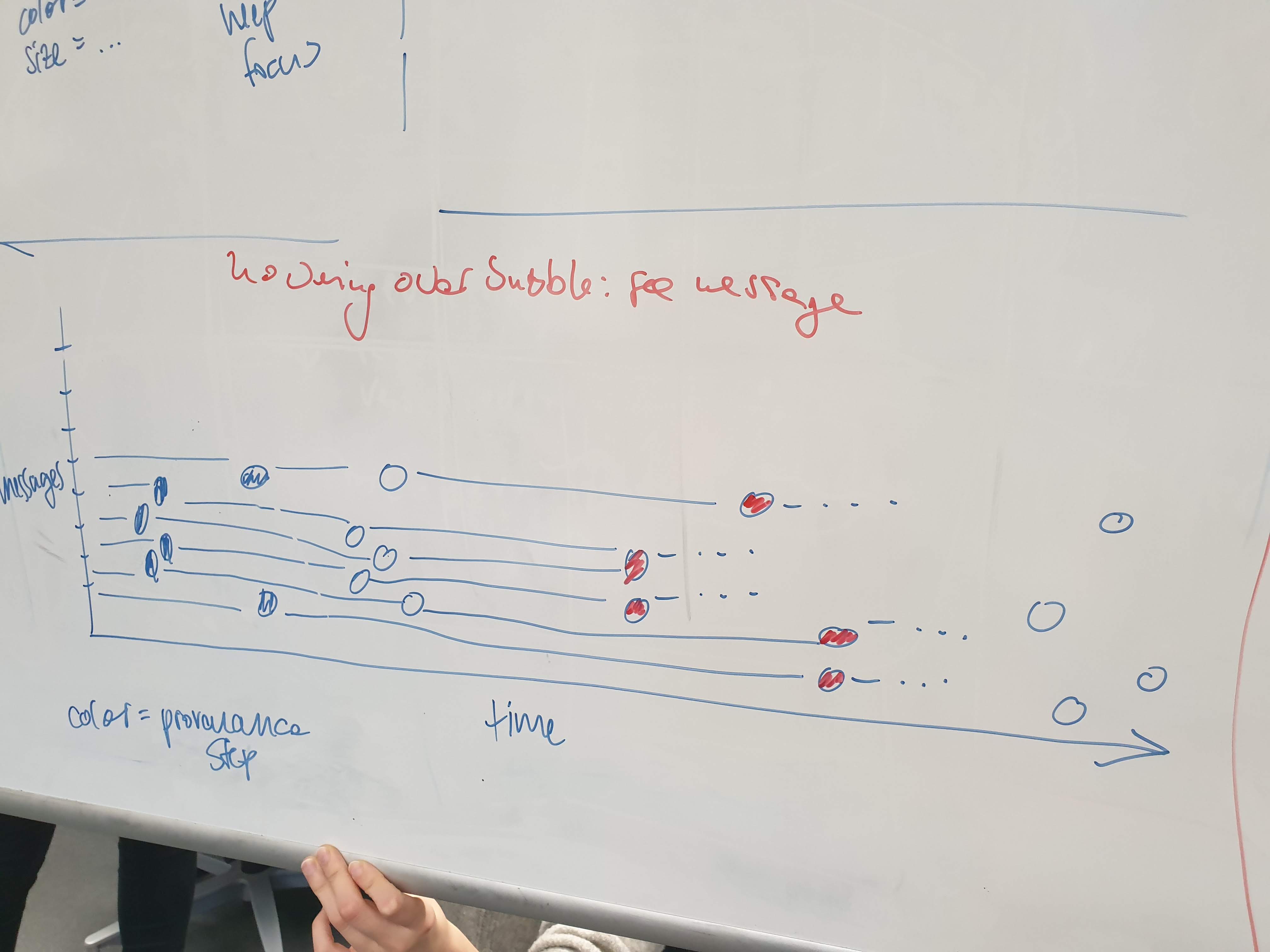 ---
#### Explanation
- Metadata visualization
- on y-axis each tick represents a message flow through the provenance chain
- x-axis represents time
- each node represents a processing step (encoded in color)
- possible use case:
- understand when the majority of messages arrived (during the radio show)
- understand where the automatic tagging system suggestions differ the most from the real topics
---
### 8Morphing Individuals
##### 1
---
#### Explanation
- Metadata visualization
- on y-axis each tick represents a message flow through the provenance chain
- x-axis represents time
- each node represents a processing step (encoded in color)
- possible use case:
- understand when the majority of messages arrived (during the radio show)
- understand where the automatic tagging system suggestions differ the most from the real topics
---
### 8Morphing Individuals
##### 1
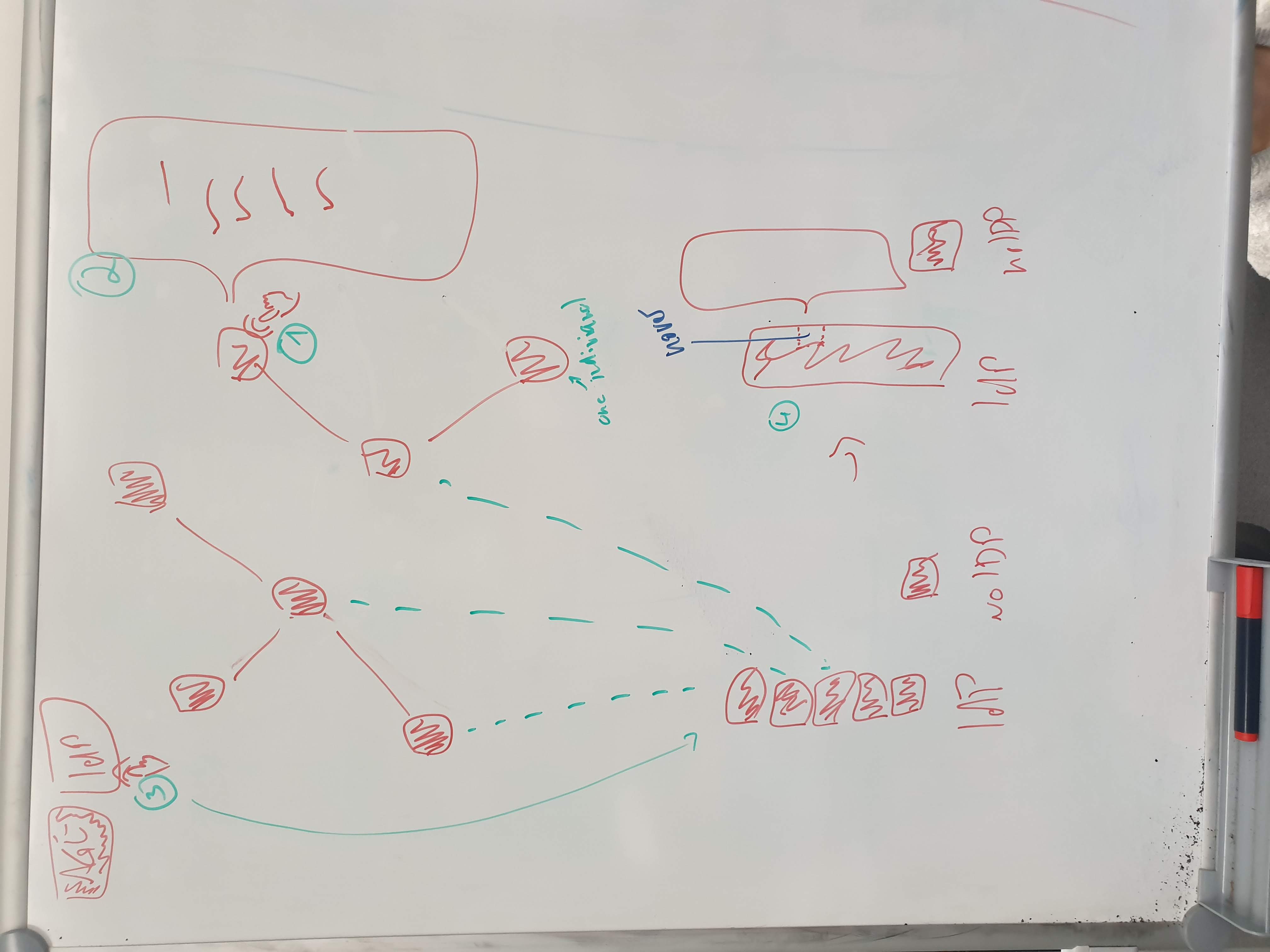 ===
#### Explanation
- Depending on the chosen filter the individuals (shown as squares) reshape to form groups denoted by the filter argument
- It is possible to chain filters, using other dimensions of data visualisation (color, texture) to show further grouping within groups denoted by a prior filter.
---
### 9 Selection for exploration
##### 1
===
#### Explanation
- Depending on the chosen filter the individuals (shown as squares) reshape to form groups denoted by the filter argument
- It is possible to chain filters, using other dimensions of data visualisation (color, texture) to show further grouping within groups denoted by a prior filter.
---
### 9 Selection for exploration
##### 1
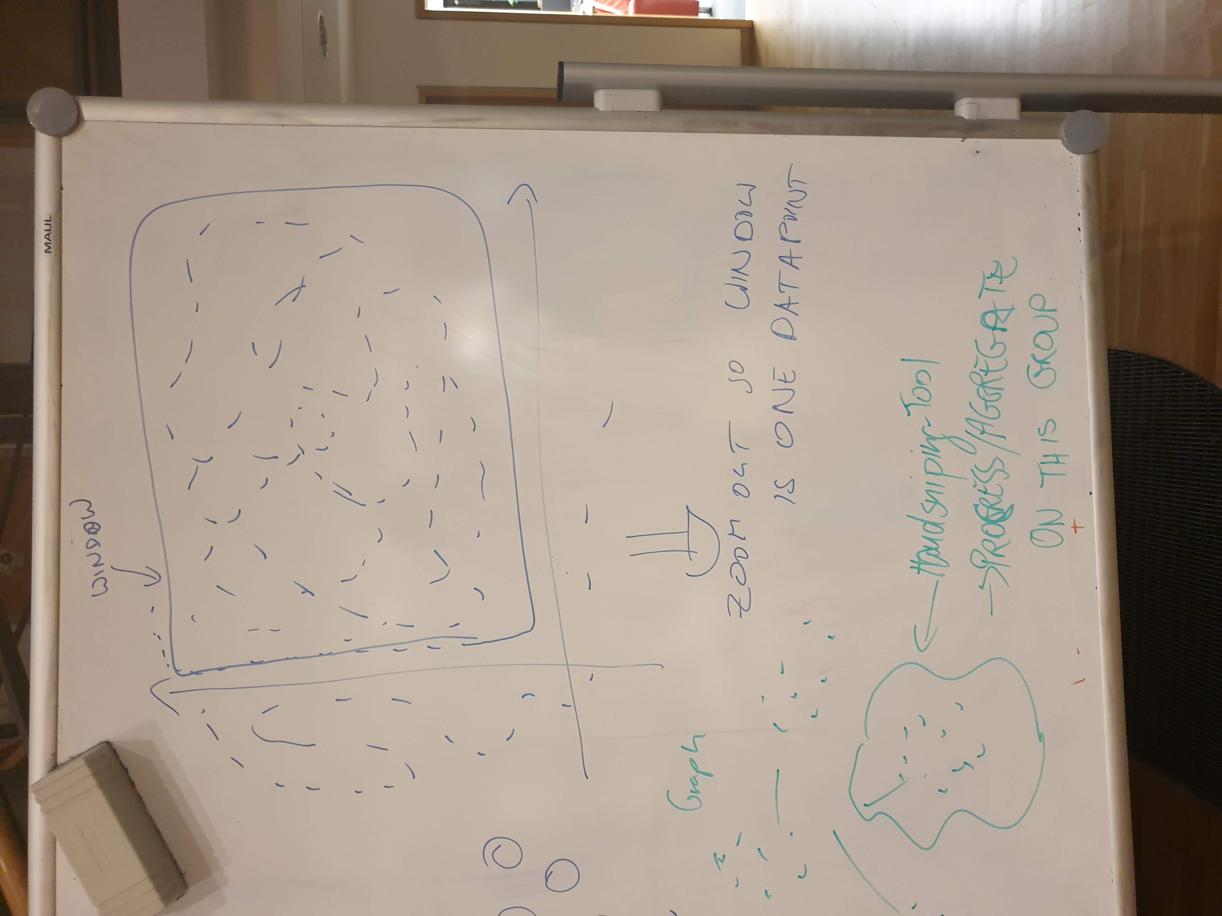 #### Explanation
- With hand-drawn selection lasso, a little subset of individuals can be grouped / filtered, like in "morphing individuals
---
### 10 Guided Exploration
#### Explanation
- With hand-drawn selection lasso, a little subset of individuals can be grouped / filtered, like in "morphing individuals
---
### 10 Guided Exploration
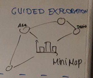 #### Explanation
- Show all the layers
- Navigate through layers sorting or filtering the parameters
- Arrows show what point of view can be shown next
- Mini map to show what paths are possible
- Make it possible to reach the same information from different directions
[storyboard](https://lively-kernel.org/lively4/BP2019RH1/doc/storyboards/guided-exploration.md)
---
### 11 Guided Filtering
#### Explanation
- Show all the layers
- Navigate through layers sorting or filtering the parameters
- Arrows show what point of view can be shown next
- Mini map to show what paths are possible
- Make it possible to reach the same information from different directions
[storyboard](https://lively-kernel.org/lively4/BP2019RH1/doc/storyboards/guided-exploration.md)
---
### 11 Guided Filtering

 #### Explanation
- Click your way through the layers
- Filtering options
- Click on bar to focus on this data and select the other parameter to compare it to
- Show active filters
- Sorting/filtering history
- Show what could be sorted/filtered next
---
### 12 Sunburst Bar Chart
#### Explanation
- Click your way through the layers
- Filtering options
- Click on bar to focus on this data and select the other parameter to compare it to
- Show active filters
- Sorting/filtering history
- Show what could be sorted/filtered next
---
### 12 Sunburst Bar Chart
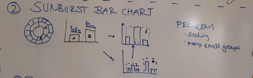 #### Explanation
- Sunburst as bar chart without 100 %
1. Show smaller diagram above the primary point of view
2. Show smaller diagram inside of the bars of the primary one
- Problems: Scaling, Many small groups
---
### 13 Data Pipeline Timeline
#### Explanation
- Sunburst as bar chart without 100 %
1. Show smaller diagram above the primary point of view
2. Show smaller diagram inside of the bars of the primary one
- Problems: Scaling, Many small groups
---
### 13 Data Pipeline Timeline

 #### Explanation
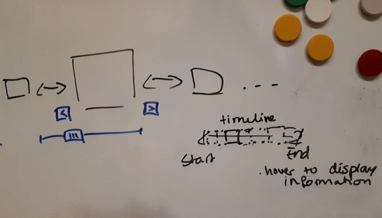
- Show the processing steps of the data
1. Timeline:
- Steps are horizontally sorted
- Show selected one more highlighted
- Make it possible to navigate (arrows, slider)
- Let a smaller timeline show, where you are in the process (slider)
---
### 14 Data Pipeline Index Cards
#### Explanation
- Show the processing steps of the data
1. Timeline:
- Steps are horizontally sorted
- Show selected one more highlighted
- Make it possible to navigate (arrows, slider)
- Let a smaller timeline show, where you are in the process (slider)
---
### 14 Data Pipeline Index Cards
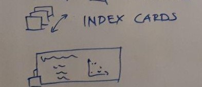 2. Index cards
- Steps are stacked (like index cards)
- Make on card bigger to show more information
---
### 15 Individual Statements
2. Index cards
- Steps are stacked (like index cards)
- Make on card bigger to show more information
---
### 15 Individual Statements
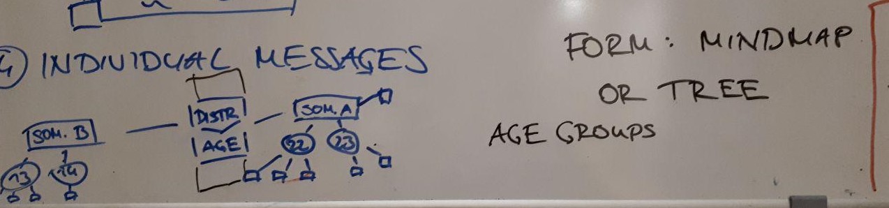 #### Explanation
First view is the - Menu in the center
- Drag and drop filtering/sorting options into the menu
- Changing which one is primary, secondary,...
- Show the individual statements as mindmap or tree
- Individuals who don't have an age but a district are directly connected/grouped to the corresponding district node.
[storyboard](https://lively-kernel.org/lively4/BP2019RH1/doc/storyboards/mindmap.md)
---
### 16 Drag'n'drop connections
#### Explanation
First view is the - Menu in the center
- Drag and drop filtering/sorting options into the menu
- Changing which one is primary, secondary,...
- Show the individual statements as mindmap or tree
- Individuals who don't have an age but a district are directly connected/grouped to the corresponding district node.
[storyboard](https://lively-kernel.org/lively4/BP2019RH1/doc/storyboards/mindmap.md)
---
### 16 Drag'n'drop connections
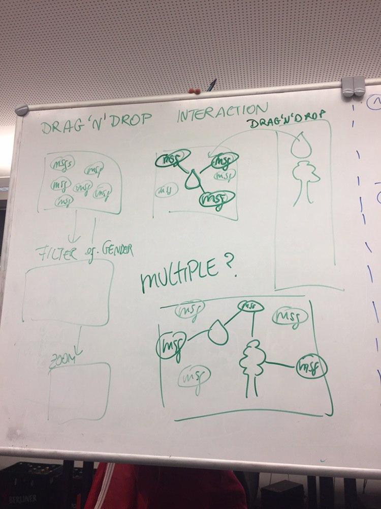 #### Explanation
First view is the messages symbolized by icons and clickable to reveal content. If icon from sidebar with theme-representing icons is chosen and dragged into messages area - messages concerning this themes get connected to the icon. (By lines, physical closeness resembling gravity ..)
---
### 17 Messages of your neighbors
#### Explanation
First view is the messages symbolized by icons and clickable to reveal content. If icon from sidebar with theme-representing icons is chosen and dragged into messages area - messages concerning this themes get connected to the icon. (By lines, physical closeness resembling gravity ..)
---
### 17 Messages of your neighbors
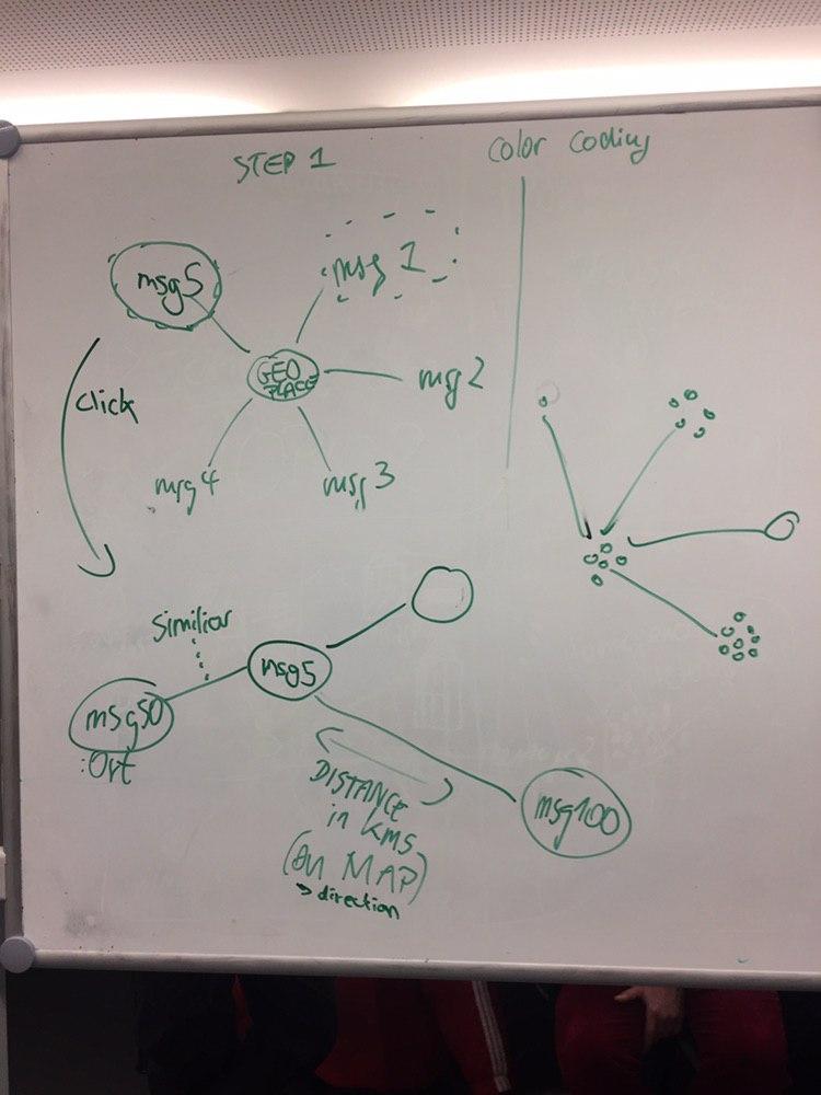 #### Explanation
One message is the reference point in the middle. The others get arranged according to their "distance" to the reference message. By clicking on another message, that message becomes the new reference point
---
### 18 Messages of your neighbor
#### Explanation
One message is the reference point in the middle. The others get arranged according to their "distance" to the reference message. By clicking on another message, that message becomes the new reference point
---
### 18 Messages of your neighbor
 #### Explanation
Messages are placed to the neighborhood, where they come from. When you zoom out, messages get abstracted by their theme. If you zoom out further, villages get abstracted by the combination of themes.
---
### 19 Radial comparison
#### Explanation
Messages are placed to the neighborhood, where they come from. When you zoom out, messages get abstracted by their theme. If you zoom out further, villages get abstracted by the combination of themes.
---
### 19 Radial comparison
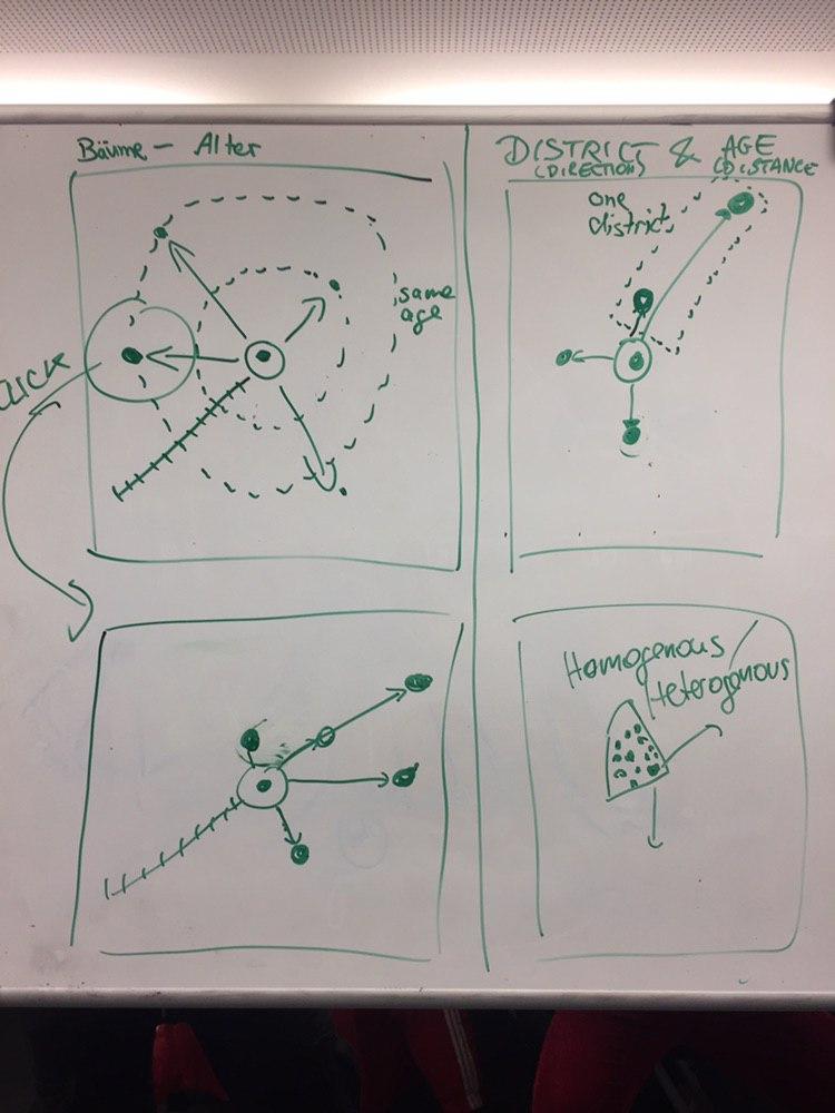 #### Explanation
One individual is the reference point in the middle. The others get arranged according to their "distance" regarding one characteristic (e.g. age) to the referenced individual. By clicking on another individual, that individual becomes the new reference point. => Also possible with 2 dimensions
---
### 20 Soundified messages
#### Explanation
One individual is the reference point in the middle. The others get arranged according to their "distance" regarding one characteristic (e.g. age) to the referenced individual. By clicking on another individual, that individual becomes the new reference point. => Also possible with 2 dimensions
---
### 20 Soundified messages
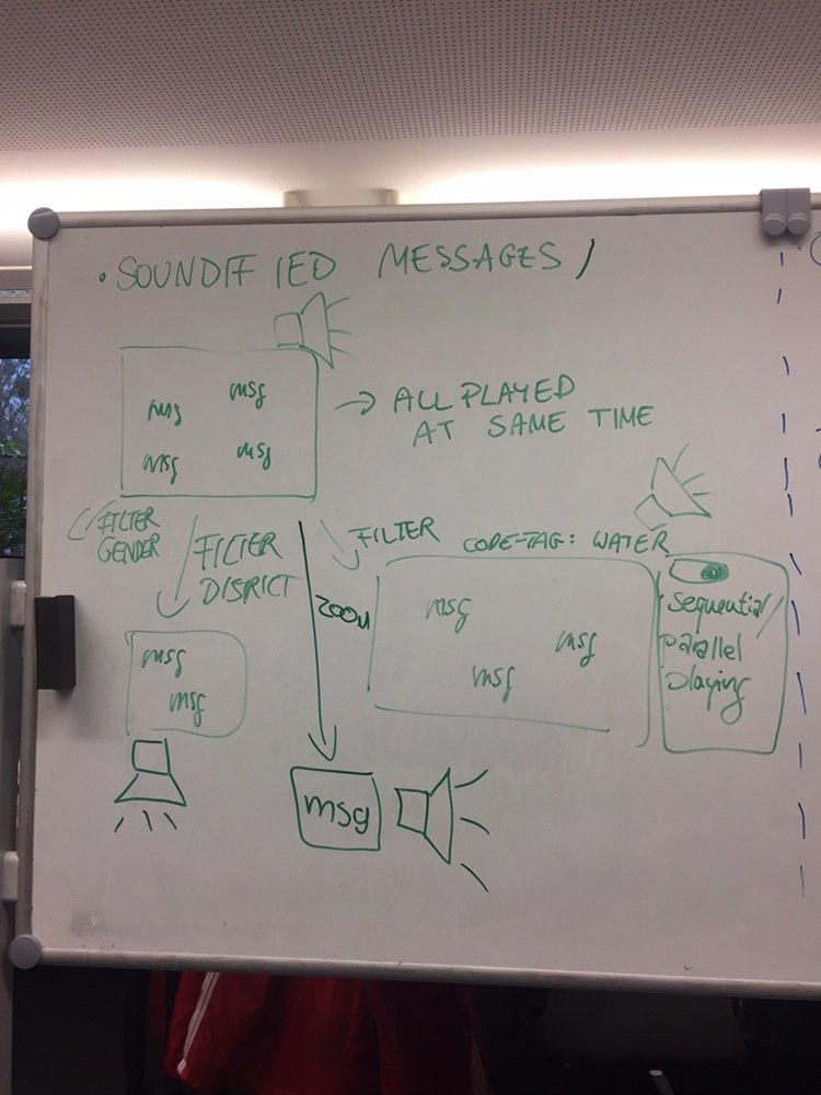 All messages are given as sound. All messages that are currently displayed in a world get read to the user at the same time. There is a button to toggle to sequential mode where messages get read sequentially and currently played messages are highlighted in the world too. You can apply filters to just hear those messages / click on one message to hear exactly that one.
---
### 21 Soundified themes
All messages are given as sound. All messages that are currently displayed in a world get read to the user at the same time. There is a button to toggle to sequential mode where messages get read sequentially and currently played messages are highlighted in the world too. You can apply filters to just hear those messages / click on one message to hear exactly that one.
---
### 21 Soundified themes
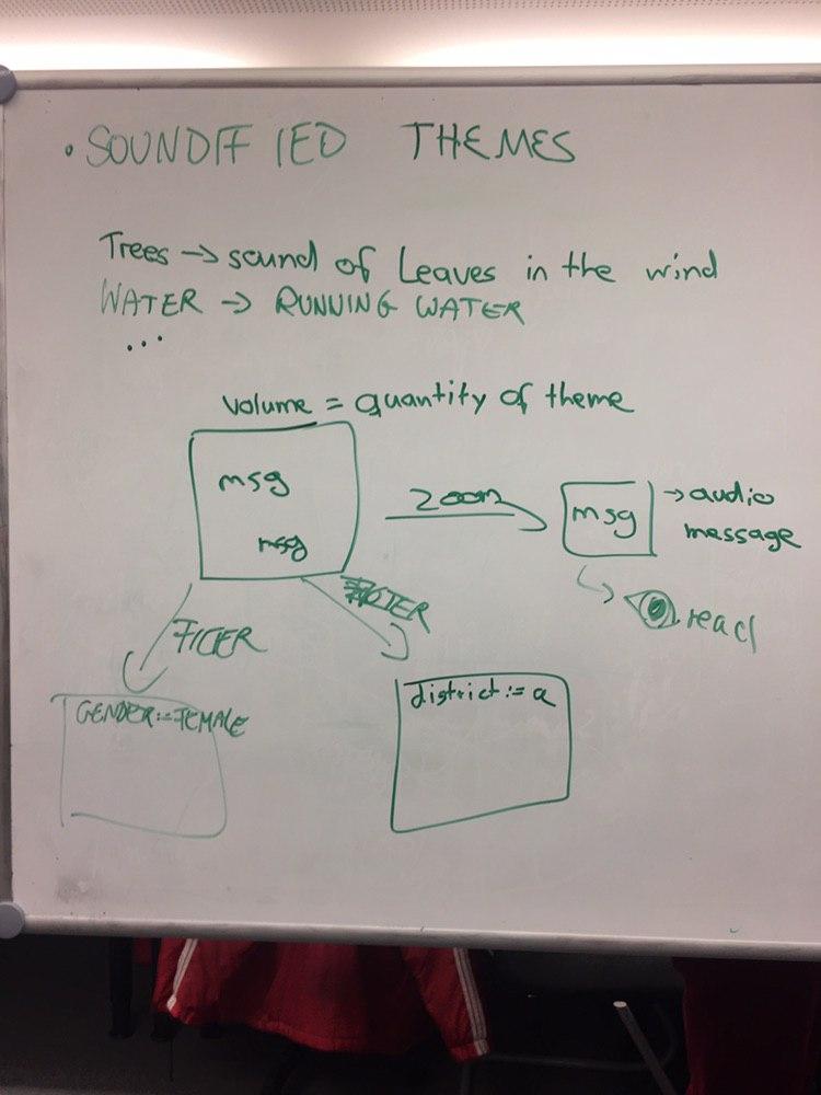 All themes are given as sound. The messages get displayed in the world. The volume for each theme is set by how many people referred to that theme. When you zoom in on one message, that message gets read. When you select a subgroup by a filter only the messages in the selection count into the calculation of theme sound volume.
---
### 22 Thought bubble
All themes are given as sound. The messages get displayed in the world. The volume for each theme is set by how many people referred to that theme. When you zoom in on one message, that message gets read. When you select a subgroup by a filter only the messages in the selection count into the calculation of theme sound volume.
---
### 22 Thought bubble
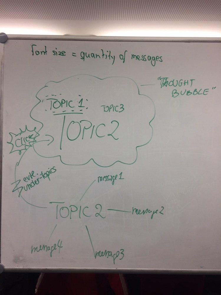 #### Explanation
Bubble where the themes are displayed. The font size is set by the quantity of messages referring to that theme. When you click on a topic, all messages referring to that theme get displayed.
#### Explanation
Bubble where the themes are displayed. The font size is set by the quantity of messages referring to that theme. When you click on a topic, all messages referring to that theme get displayed.