BP2019RH1 - Introduction, Motivation, Current Status
Wanda Baltzer, Theresa Hradilak, Lara Pfennigschmidt, Luc Prestin, Moritz Spranger, Simon Stadlinger, Leo Wendt
2020
Software Architecture Group
Hasso Plattner Institute
University of Potsdam, Germany
---
# Welcome People!!
{width="650" style="display: block;margin-left: auto; margin-right: auto; width: 70%;"}
---
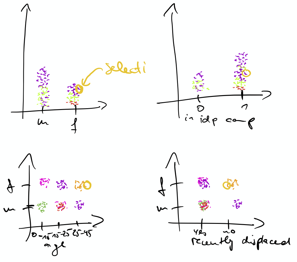
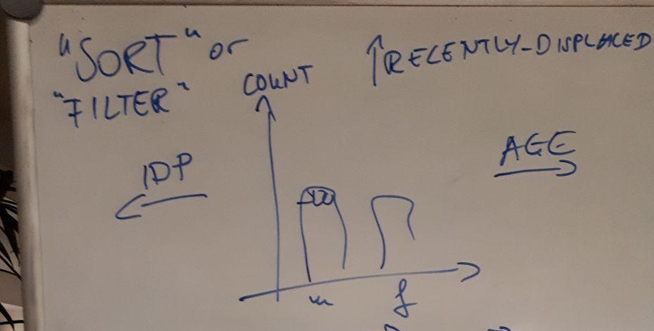
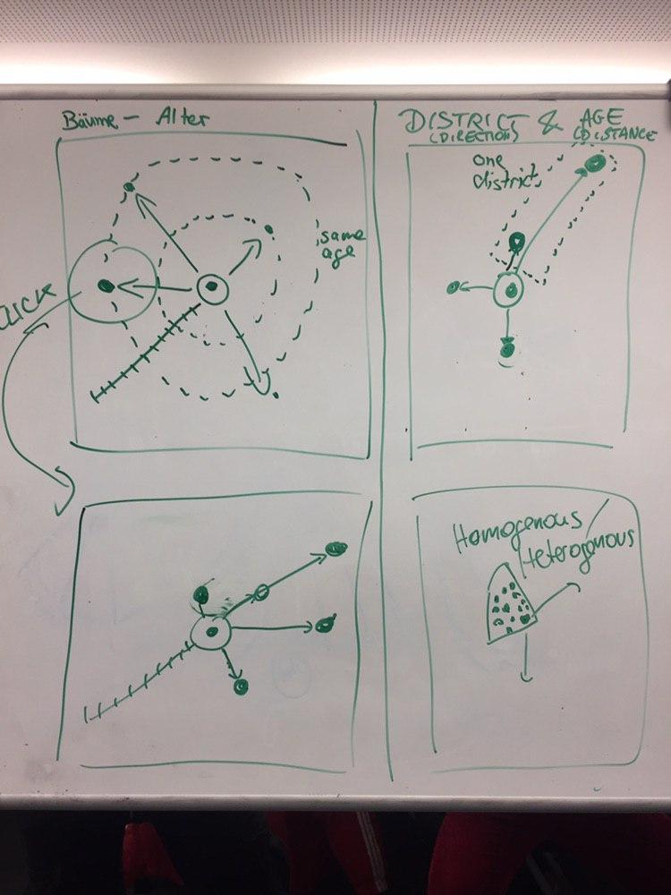
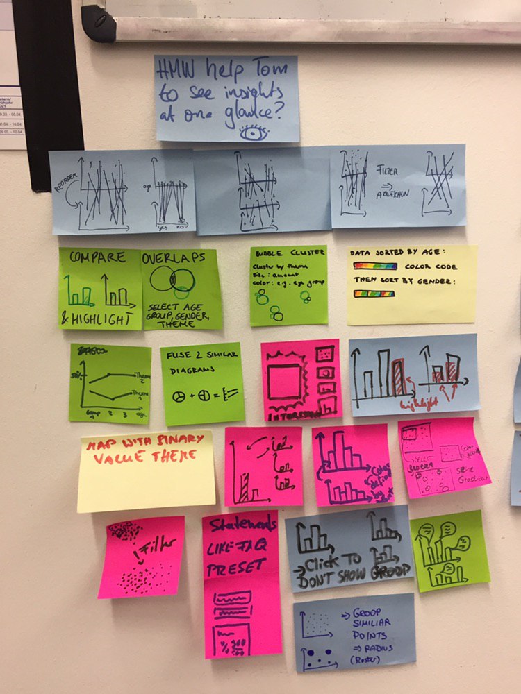
# Creative Session 16.12.19
- Brainstorming on whiteboards
{"height=200"}
 {height="200"}
{height="200"}
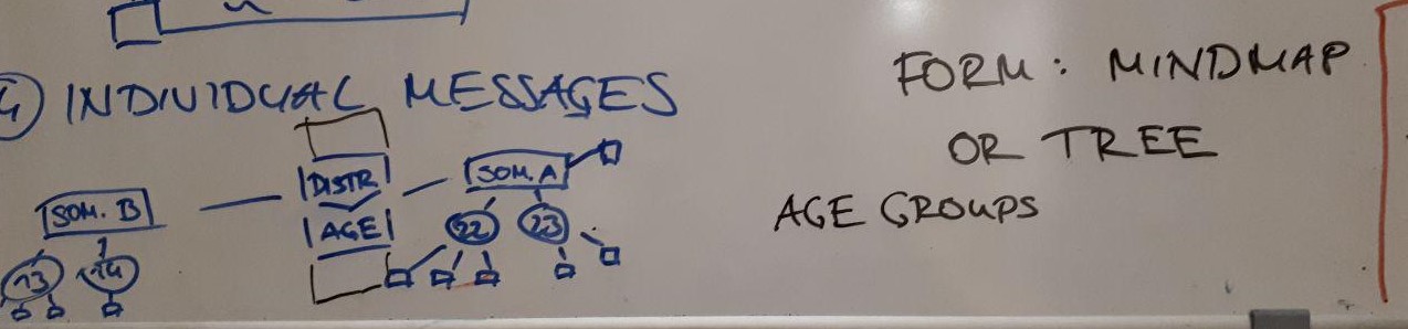 [More diagrams](https://lively-kernel.org/lively4/BP2019RH1/doc/visualization-brainstorming/monday12-16.md#@0)
---
## Taxonomy
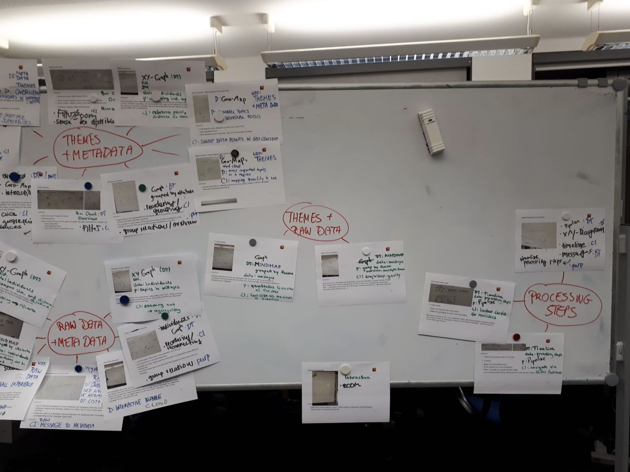{height="500"}
---
## Storyboards
- Picked two visualization ideas
- Tried to make it more concrete
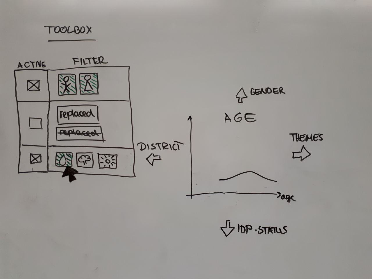{"height=400"}
---
# Design Thinking Workshop 27.01.20
1. Described "Tom", a researcher
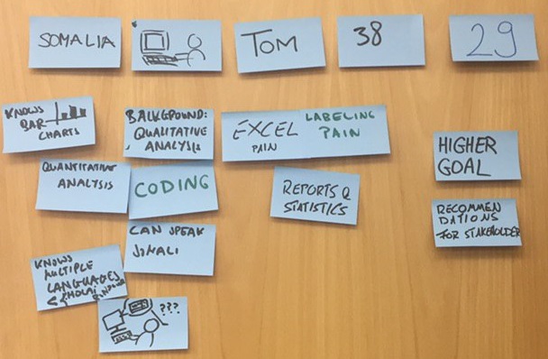{"height=300"}
2. Investigated his needs
- e.g. "For Tom, it would be life changing, if he could see insights at one glance, because gaining insights out of Excel is difficult."
---
# Design Thinking Workshop 27.01.20
{"height=400", style="float:right"}
3. Posed "How might we...?" questions
- How might we make the process that led to his recommendations comprehensible to other people?
- How might we help Tom to see insights at one glance?
4. Brainstormed based on those questions to create new visualization ideas
---
# Data Analysis
#### Next Slides
- Updated / more detailed Context
- Generated Output
- Pipeline analysis
---
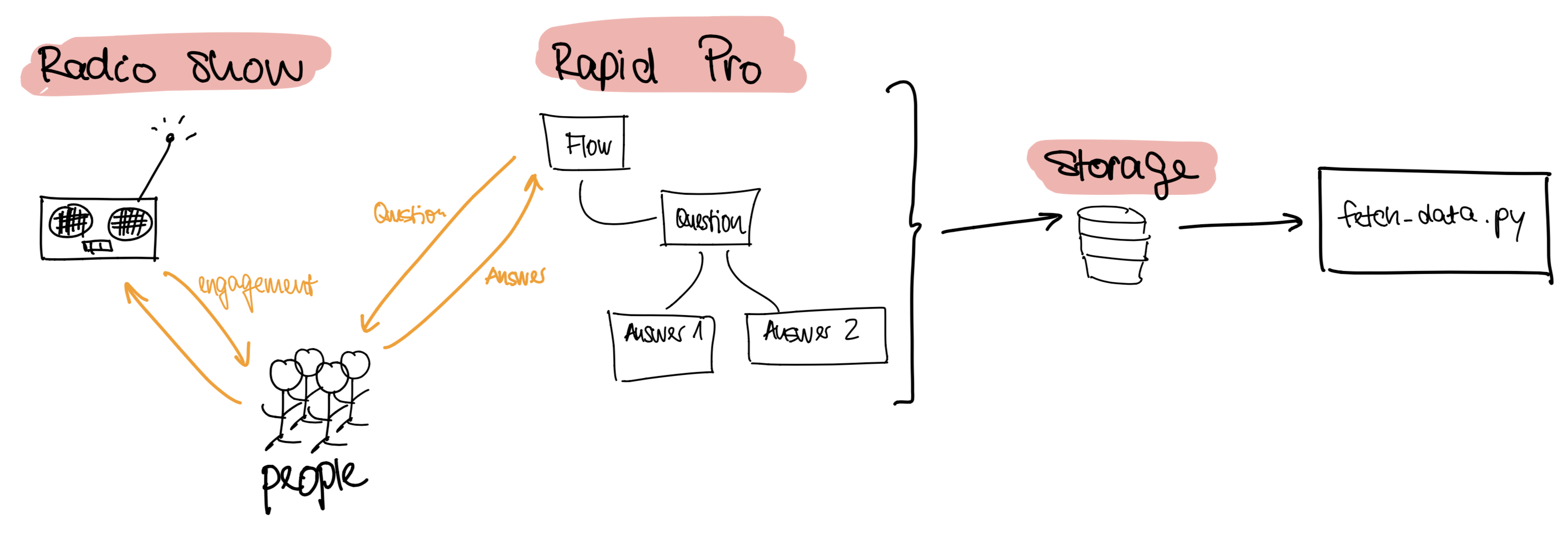
# Updated Context 1/2
{height="350"}
#### Useful links
- RapidPro: https://rapidpro.io/
---
# Updated Context 2/2
{height="300"}
#### Useful links
- Jupyter Notebook: https://github.com/hpi-swa-lab/BP2019RH1-data/tree/master/DataExploration
- Scripts of AvF:
- Generate Outputs: https://github.com/AfricasVoices/Project-OCHA/blob/master/generate_outputs.py
---
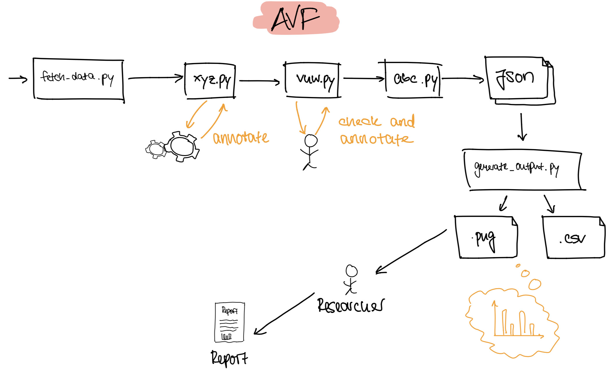
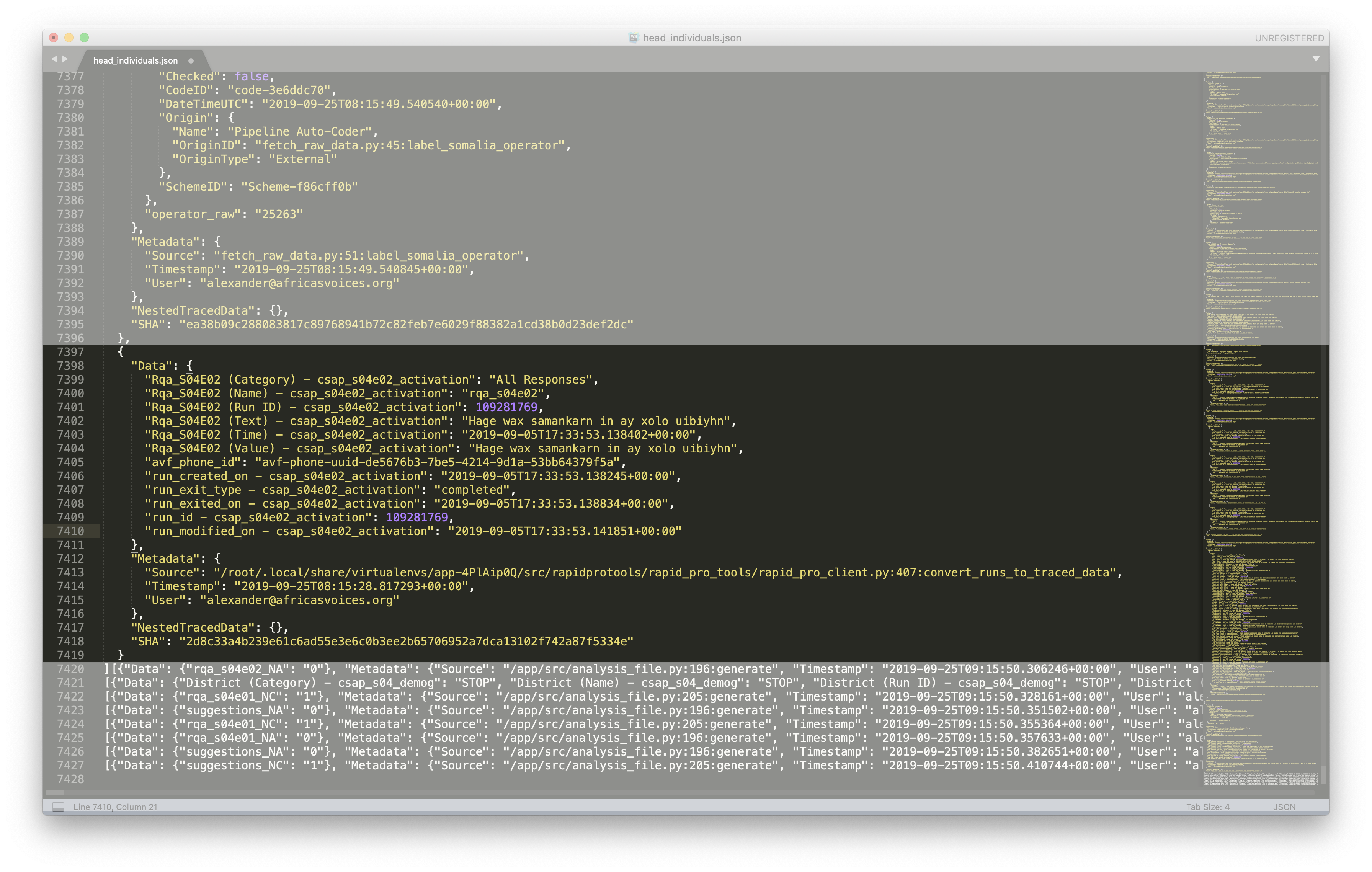
# Pipeline Analysis Foundation
{height="550"}
---
{height="600"}
---
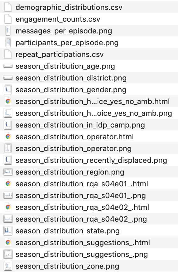
# Data analysis from us
#### Jupyter Notebook
#### Questions to think about:
- With regards to the visualizations we showed: How can we make use of history of attributes?
- With regards to scripts that can be seen: How can we make use of the scripts to visualize the pipeline?
- With regards to the serialized data object chain: How can we make use of the traced Data Object to visualize the pipeline?
---
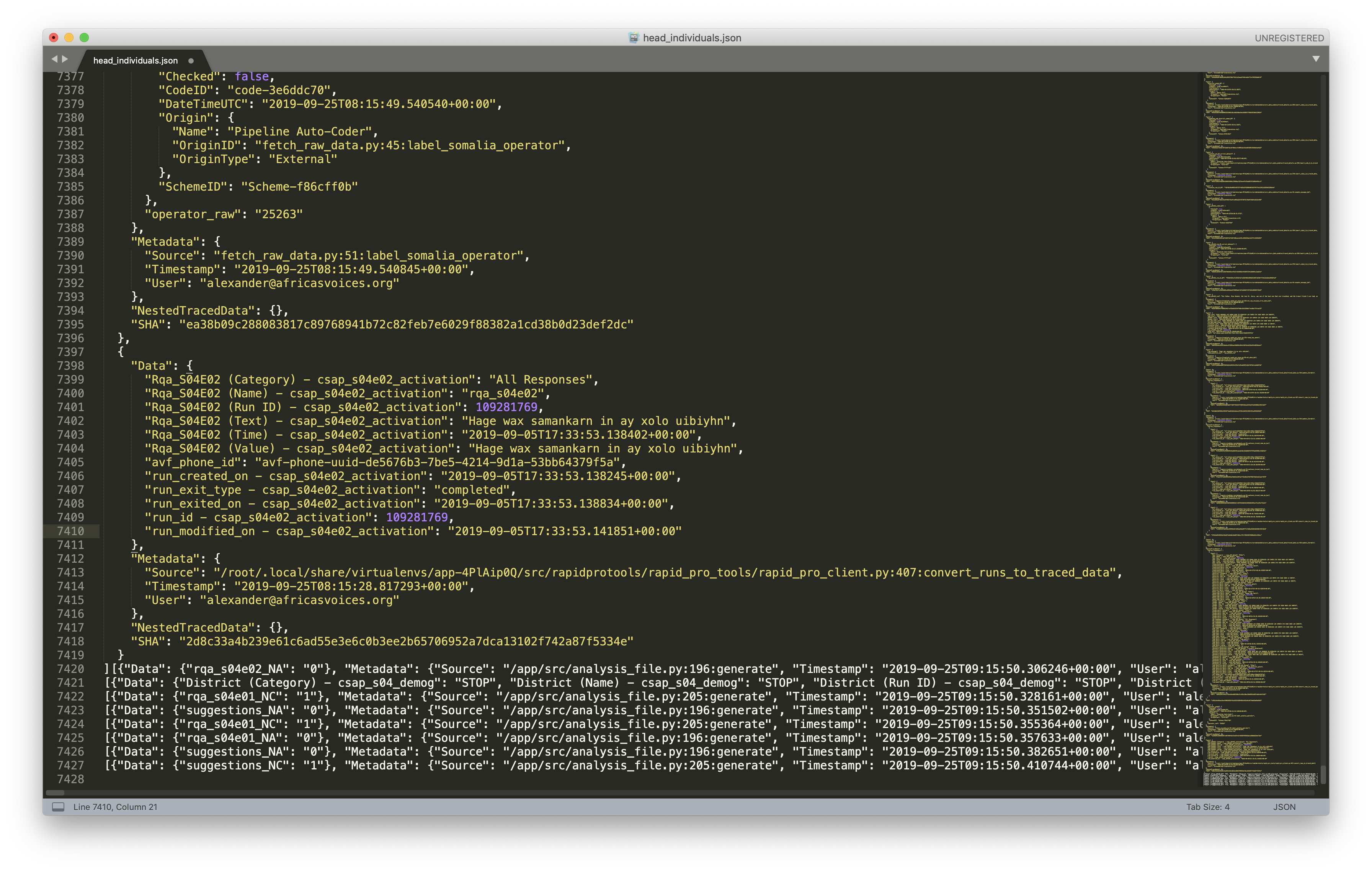
# Generated Output 1/3
{height="500"}
---
# Generated Output 2/3
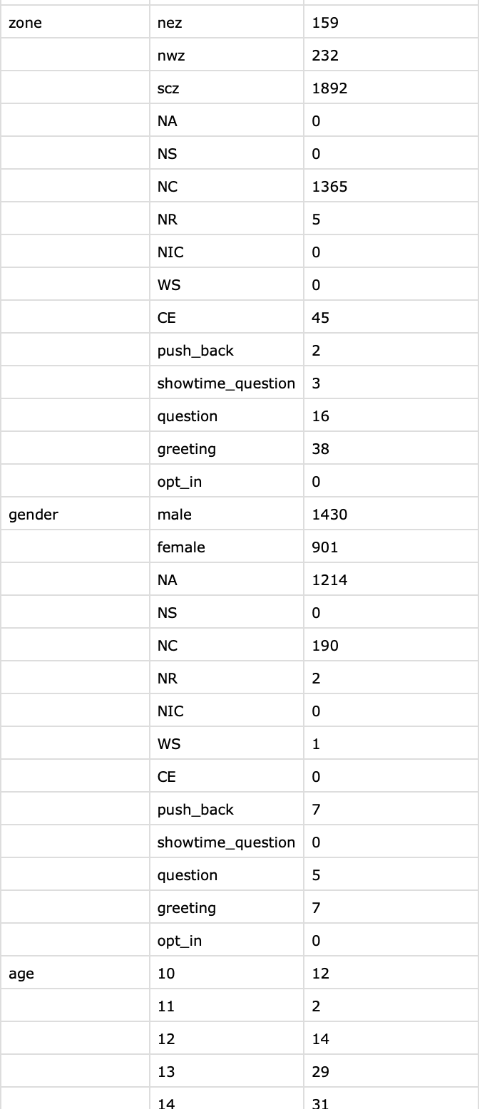{height="500"}
---
# Generated Output 3/3
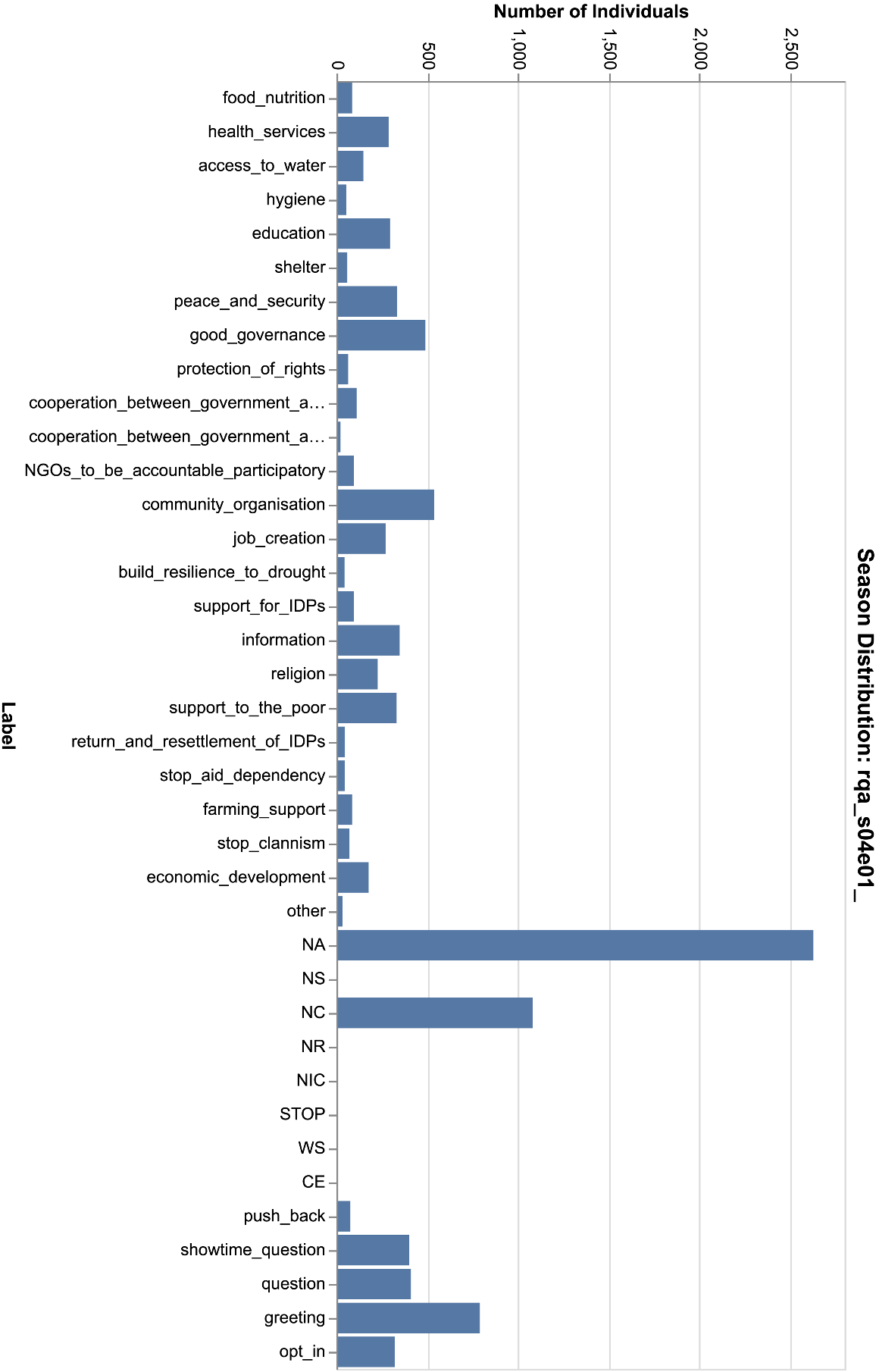{height="500"}
---
# Generated Output Problems
- Losing rich structured information about individuals.
- Long pipeline that keeps together information about one individual
- Throwing away in last step from information to research basis.
Output, aggregated Data is not very useful for our work.
---
# Further Research Insights
#### Structure of Reports:
- Structured by insights gained from radio show
- Then supported through diagrams, single messages
- Comparison between this year and last year
- Focusing on majority of opinions
- Footnotes explaining chart/scales
---
# Why do we do all this and where are we now?
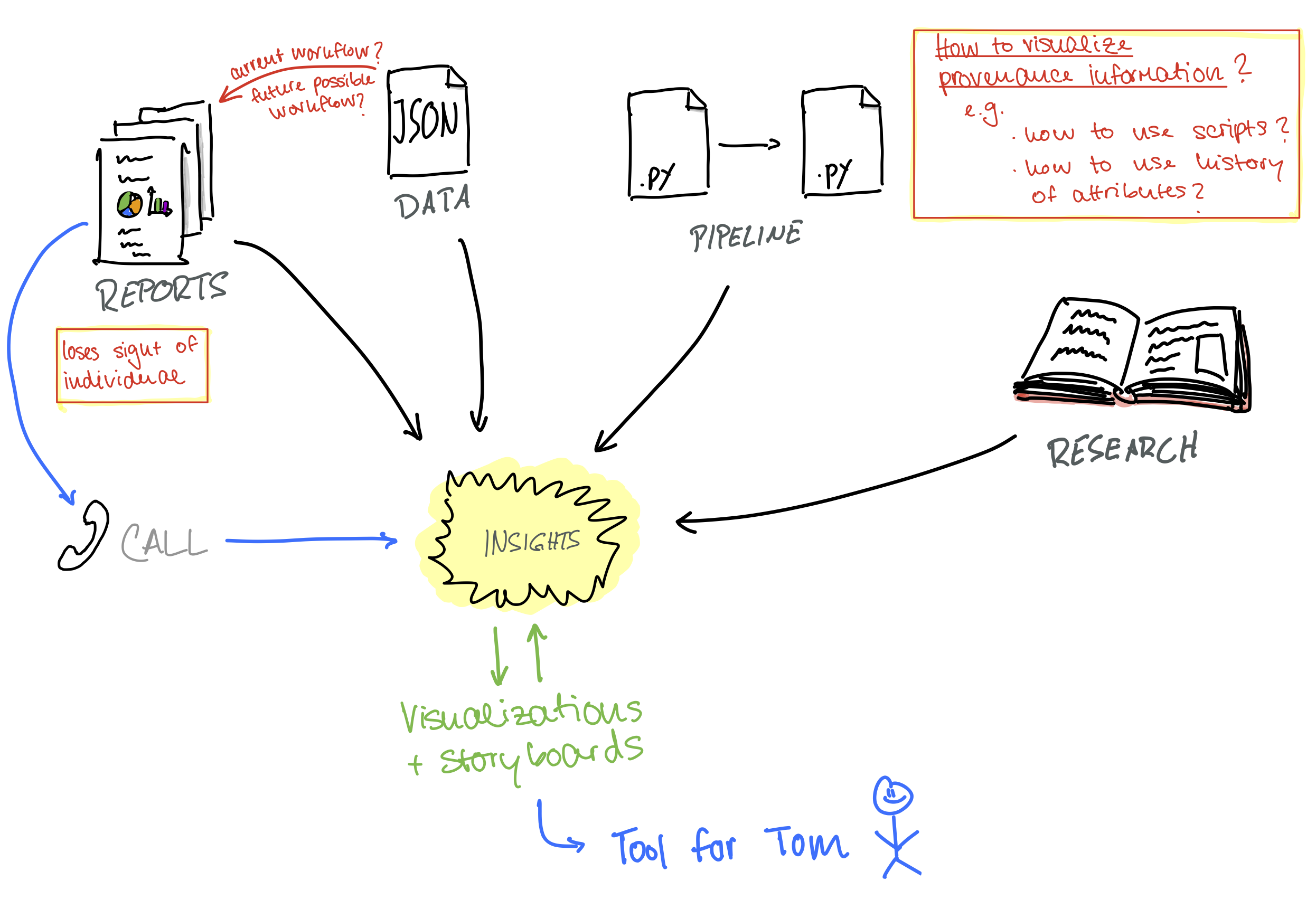{height="500"}
---
# What's next?
- Mid February: 50-70 visualization ideas, 10 storyboards
- Talk with researchers, validate ideas
[More diagrams](https://lively-kernel.org/lively4/BP2019RH1/doc/visualization-brainstorming/monday12-16.md#@0)
---
## Taxonomy
{height="500"}
---
## Storyboards
- Picked two visualization ideas
- Tried to make it more concrete
{"height=400"}
---
# Design Thinking Workshop 27.01.20
1. Described "Tom", a researcher
{"height=300"}
2. Investigated his needs
- e.g. "For Tom, it would be life changing, if he could see insights at one glance, because gaining insights out of Excel is difficult."
---
# Design Thinking Workshop 27.01.20
{"height=400", style="float:right"}
3. Posed "How might we...?" questions
- How might we make the process that led to his recommendations comprehensible to other people?
- How might we help Tom to see insights at one glance?
4. Brainstormed based on those questions to create new visualization ideas
---
# Data Analysis
#### Next Slides
- Updated / more detailed Context
- Generated Output
- Pipeline analysis
---
# Updated Context 1/2
{height="350"}
#### Useful links
- RapidPro: https://rapidpro.io/
---
# Updated Context 2/2
{height="300"}
#### Useful links
- Jupyter Notebook: https://github.com/hpi-swa-lab/BP2019RH1-data/tree/master/DataExploration
- Scripts of AvF:
- Generate Outputs: https://github.com/AfricasVoices/Project-OCHA/blob/master/generate_outputs.py
---
# Pipeline Analysis Foundation
{height="550"}
---
{height="600"}
---
# Data analysis from us
#### Jupyter Notebook
#### Questions to think about:
- With regards to the visualizations we showed: How can we make use of history of attributes?
- With regards to scripts that can be seen: How can we make use of the scripts to visualize the pipeline?
- With regards to the serialized data object chain: How can we make use of the traced Data Object to visualize the pipeline?
---
# Generated Output 1/3
{height="500"}
---
# Generated Output 2/3
{height="500"}
---
# Generated Output 3/3
{height="500"}
---
# Generated Output Problems
- Losing rich structured information about individuals.
- Long pipeline that keeps together information about one individual
- Throwing away in last step from information to research basis.
Output, aggregated Data is not very useful for our work.
---
# Further Research Insights
#### Structure of Reports:
- Structured by insights gained from radio show
- Then supported through diagrams, single messages
- Comparison between this year and last year
- Focusing on majority of opinions
- Footnotes explaining chart/scales
---
# Why do we do all this and where are we now?
{height="500"}
---
# What's next?
- Mid February: 50-70 visualization ideas, 10 storyboards
- Talk with researchers, validate ideas